Unlike sales data which reflects a longer-term mindset, rental data is a great proxy for visualising short-term shifts in priorities within the housing market.
A year of stay-at-home orders and the closing of social venues have led many people to rethink their priorities in terms of where they want to live. Proximity to work is not so important when the office is closed.
With commuting times and social attractions removed from people's calculations and perhaps having experienced a lockdown or two in a small flat, lower density living with more space has clearly won out.
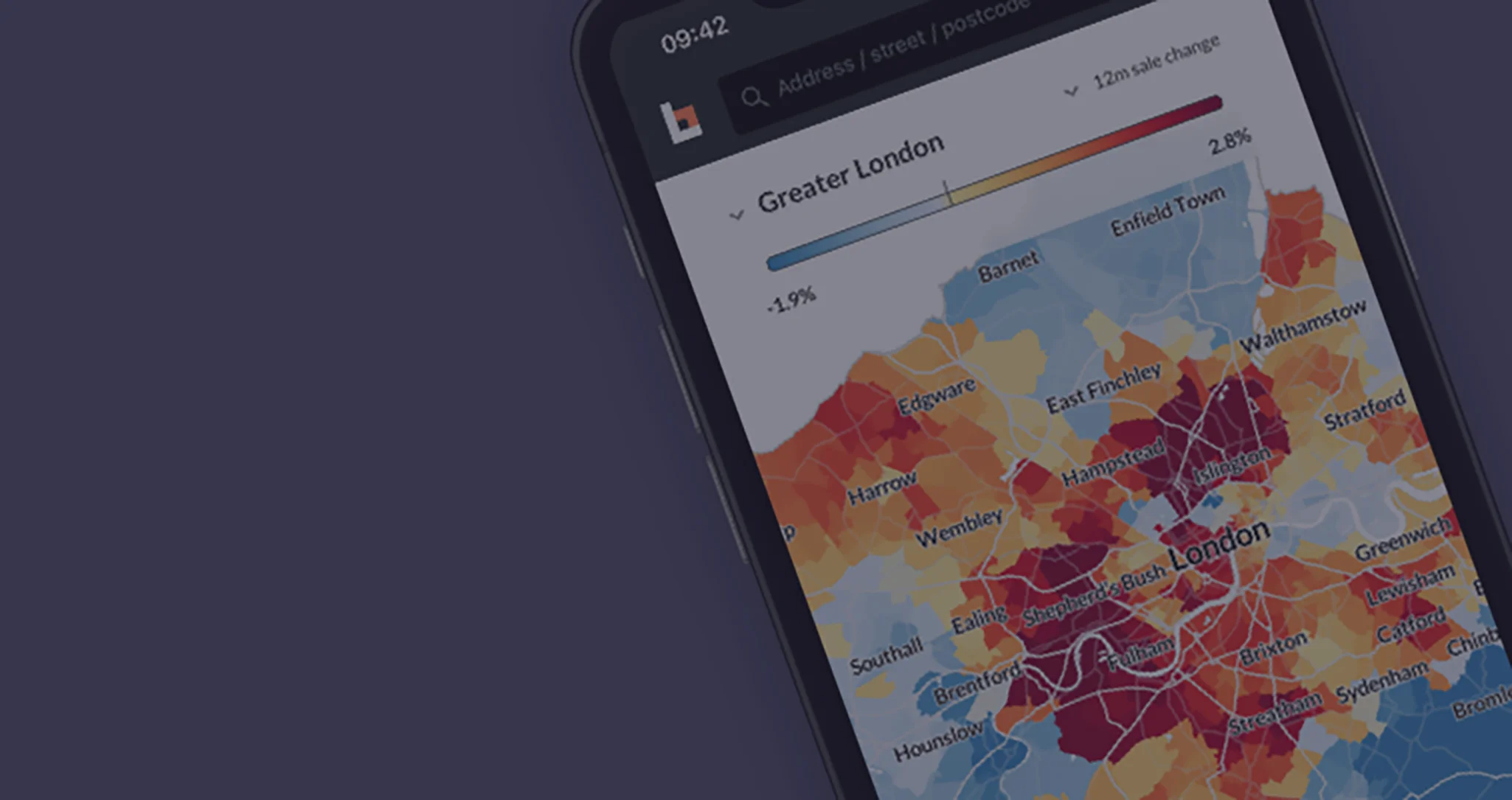
Using the Bricks&Logic interactive map, we can visualise the changing rental prices over the last year.
Blue indicates a drop in pricing and red an increase. The intensity of the colours indicates how sharply the values are rising or falling.
(See Fig 01)

Using the Bricks&Logic interactive map, we can visualise the changing rental prices over the last year.
Blue indicates a drop in pricing and red an increase. The intensity of the colours indicates how sharply the values are rising or falling.
(See Fig 01)
While the interactive map is a great tool for visualising this data, we can also analyse the data by different criteria.
In Chart 01, we are showing average changes by postcode district.

While the interactive map is a great tool for visualising this data, we can also analyse the data by different criteria.
In Chart 01, we are showing average changes by postcode district.
To see our sale and rental price estimates for your flat or house and track the changes over time, go to www.bricksandlogic.com.

To see our sale and rental price estimates for your flat or house and track the changes over time, go to www.bricksandlogic.com.